Rely Digital Got a New Look! A Behind-the-Scenes Look at Our Rebrand

As a visual designer with a deep passion for storytelling, I’ve worked on a range of branding projects, from small local businesses to big tech companies. I thrive on collaborating closely with cross-functional teams to bring brand stories to life across platforms, from print to digital. Working in an agency, my day-to-day tasks primarily involve creating designs for clients. However, this time it’s a bit different, as I was leading a full rebrand for our own company, where Rely Digital became one of my clients.
Why a Rebrand?
In a fast-paced world, everything is constantly changing. We understand that our clients are transforming to adapt to today’s market, and so are we! To appeal to mid-market stakeholders and reflect the evolution of the agency, the Rely Digital brand needed to be repositioned to speak to where we’re heading.
Over the past year, Rely Digital has undergone a transformation. As we shifted our focus toward Brand Discoverability – helping clients get found, grow, and be remembered. It became clear that limiting ourselves to performance marketing was no longer the full picture of what we do.
To reflect our expanding capabilities and our commitment to sustainable growth, Rely Digital's identity had to be repositioned. Not just a facelift but a realignment to strengthen our essence. One that speaks to who we are now and where we're headed.
The Changes
The Old Identity
One of the first steps in a rebrand is analyzing the current graphic styles and assets.
The original Rely Digital brand had a warm, moderately vibrant colour palette and a logomark that leaned heavily on the golden ratio, paired with a geometric sans-serif that had a soft, slightly bubbly feel.
The branding had an interesting approach, but interesting doesn’t always work.
The visual elements, while thoughtful when viewed separately, didn’t work together as a cohesive system. Moreover, they didn’t reflect the direction we are heading. In a fast-moving market, the brand needed to communicate more confidence and professionalism, one that resonates with broader mid-market businesses.

The Exploration
I spent time studying the competitive landscape, researching how leading agencies position themselves visually and what they communicate through their brand. Mapping them all out together in one view made it possible to spot the gaps and find real opportunities for differentiation.
For Rely Digital, we wanted to own that space intentionally. The new brand direction is anchored in four core qualities: confident in its presence, innovative in its approach, creative in its expression, and unique in the way it stands apart.
I like to use the transitional sketching method as my starting point to brainstorm and to explore – it’s a valuable process in a design project. The process is messy and raw, but it helps generate ideas that I may not have initially thought of. Before bringing the logo to perfect pixelation, there is always a period of genuine exploration.
Initially, I revisited the golden ratio concept from the old mark, pushing it to see if it could evolve into something that better captured our brand's mood. But it was missing depth – a visual depth that amplifies brand awareness and holds up across every digital touchpoint.
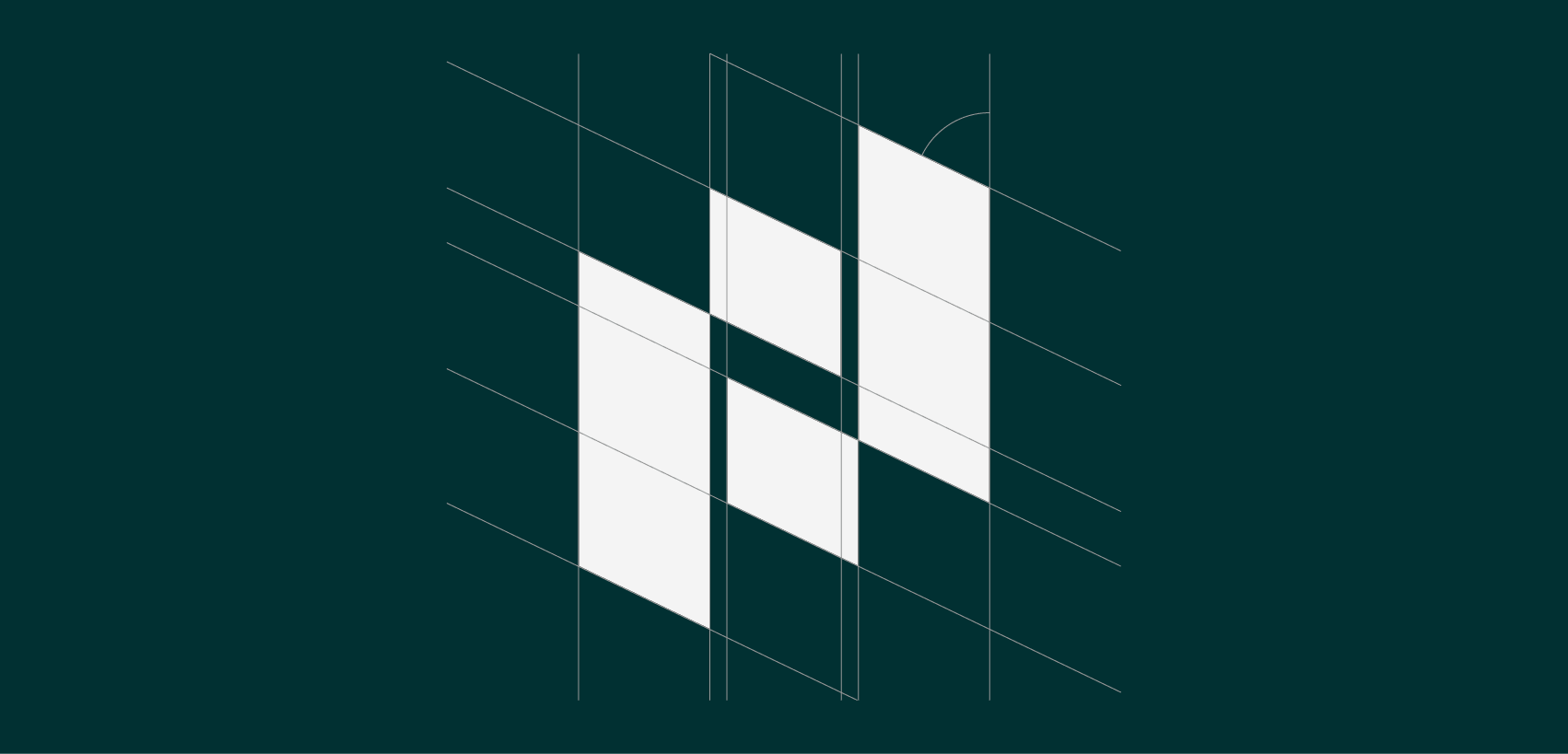
That's when I shifted to grids as a foundation – the idea of building blocks coming together, and slowly things started to click.
Behind the New Design: Built to Be Discovered
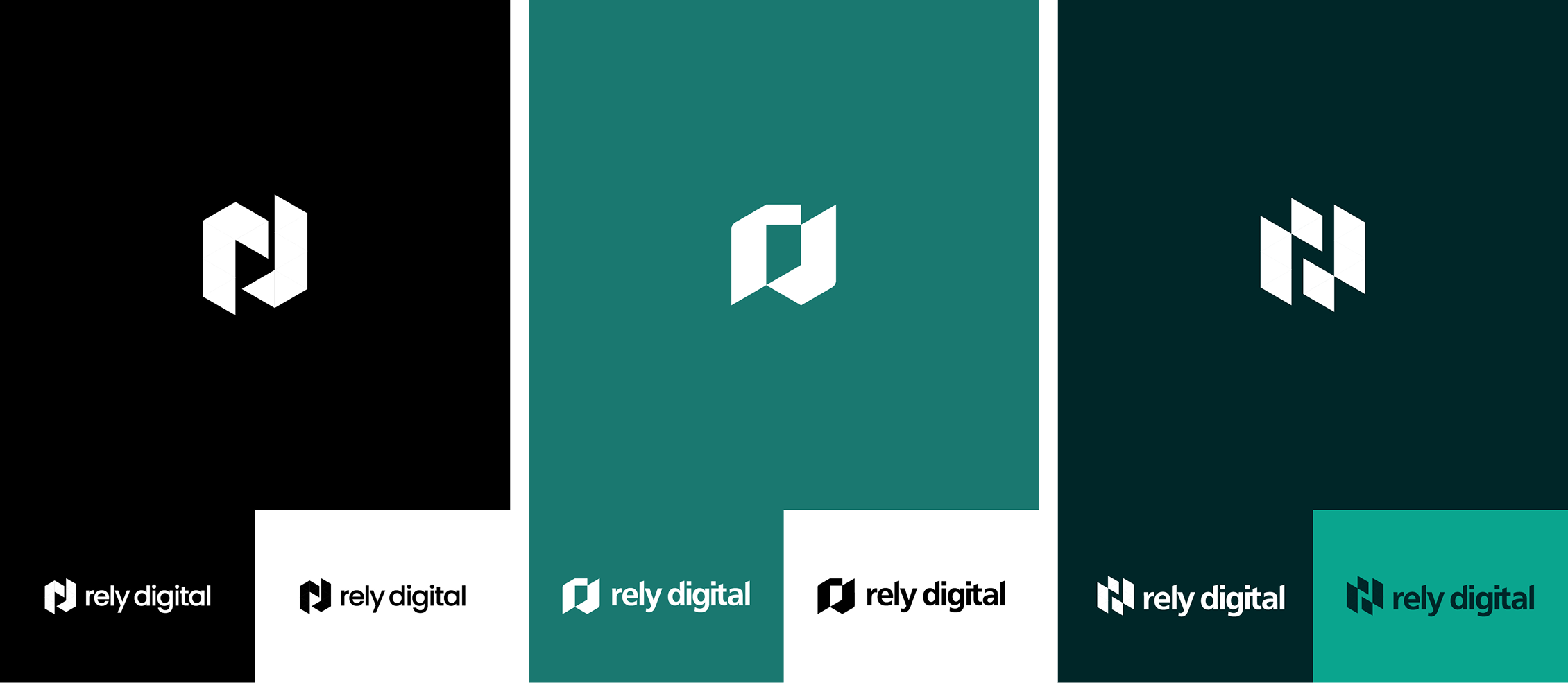
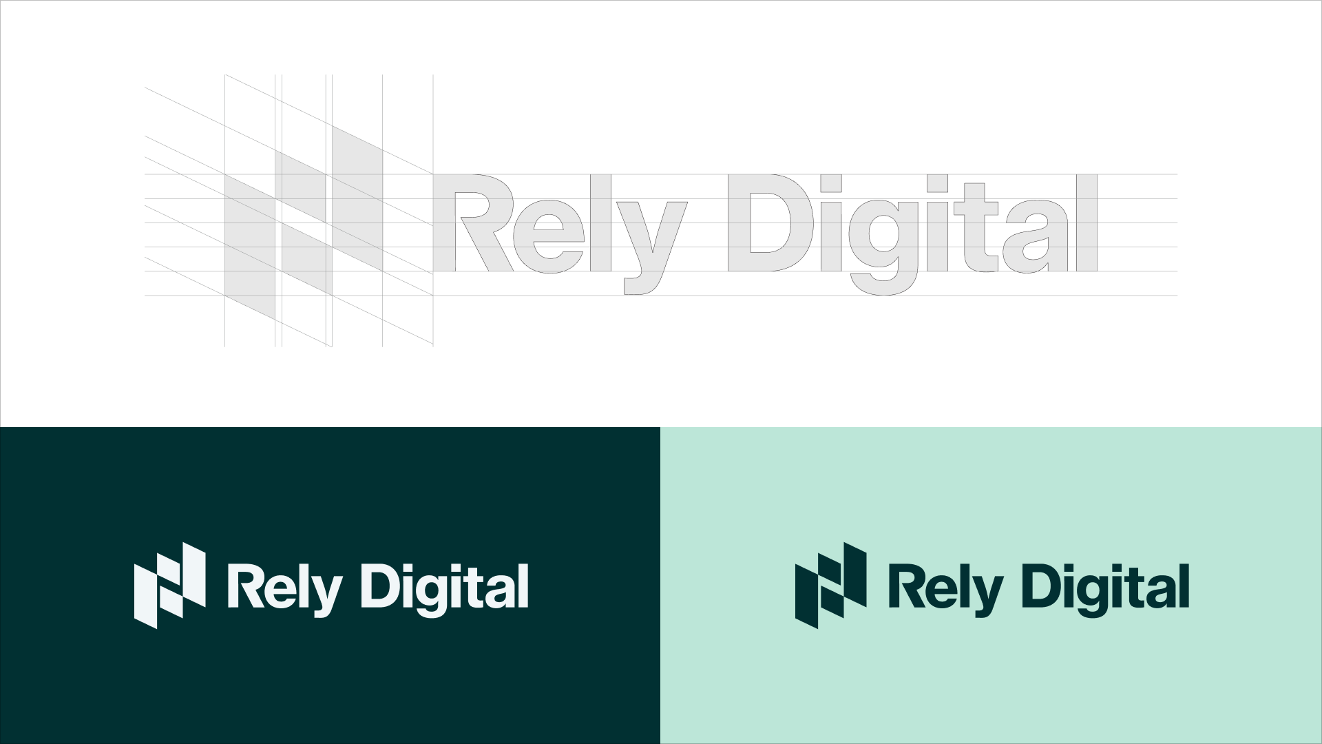
The New Logo
The new logomark keeps our founding initials: the R and D, and reimagines them through a geometric grid that introduces depth, balance, and deliberate abstraction.
Depending on how you see it, the mark can be read as:
- Modular building blocks assembling into something greater – a nod to collaboration and strategic thinking
- An ascending bar chart: a quiet signal of upward momentum and measurable results
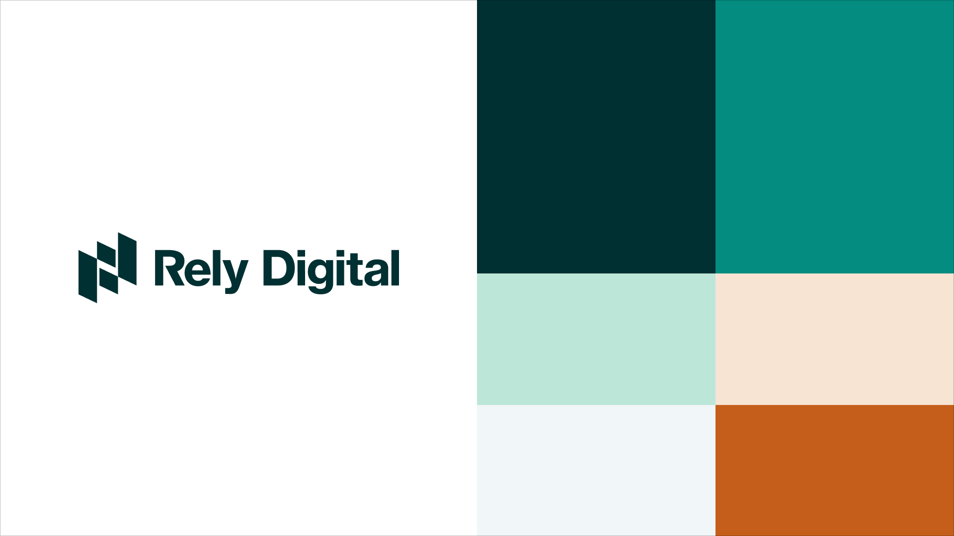
The New Colour Palette
The original colour palette leaned warm and moderately vibrant – an approachable choice, but one that worked against the brand over time. The tones felt inconsistent across applications, and for an agency positioning itself to mid-market businesses, it wasn’t communicating the right level of confidence.
The new palette is an intentional evolution, not a departure. Two primary colours form the foundation: Forest, a deep, almost midnight green that grounds the brand with authority and quiet confidence, and Pine, a vivid teal that brings energy, clarity, and a distinctly digital edge. The secondary palette introduces four supporting colours used for accents and contrast: Mint adds a soft, airy freshness; Soft Sand brings warmth and approachability to lighter compositions; Snow keeps digital layouts clean and uncluttered; and Burnt Amber enters as a bold contrast that draws the eye to key moments without competing with the primary system. Together, the palette communicates a brand that is professional without being cold, and creative without being loud.
Website Revamp: Clarity Over Clutter
The old website had a common problem: too much information, not enough organization. Visitors had to work to understand what we offer – and that's a problem when attention spans are short, and first impressions are crucial.

What changed for the new site:
- Simplified navigation with all services scannable at a glance
- Re-organized content with a cleaner layout that highlights our specialties without constant scrolling
- A brand new Industry Pages section
The Industry Pages are probably the most strategic addition to the site. While the service page tells people what we do, the industry pages tell people who we do it for. When someone from specific industries lands on our site, we want them to feel immediately understood – like they have come and found the team that gets their business model, and their specific challenges.
Each industry page includes:
- An overview of the industry and how companies in that space typically grow
- Common marketing and growth challenges for that vertical
- How our services – SEO, Paid Media, Creative Design, Analytics – apply specifically to that industry
- Typical strategy and growth approaches
- Case studies and real examples
- Recommended channels and KPIs
Check out the new industry page here: relydigital.com/industries
Visual Language

Where We Go From Here
This rebrand has been a long time coming. It feels really good to have it out in the world.
I’m very excited about the new look and what it signals: a more intentional, outward-facing version of Rely Digital. Building our own brand presence isn’t separate from the work I do for clients. I apply the same design practice to explore and re-learn our own brand story; and it’s a process I genuinely love.
This is also just the beginning. The brand will continue to evolve as we do, and I look forward to every stage of the journey.
Every brand has a story worth telling. The trick is making sure the right people see it.
Whether you’re starting from scratch, refreshing an existing identity, or building out the full picture, from logo design, corporate identity, advertising, video, website and more – we’d love to be part of that journey.
Let’s figure out what your brand could be. Get in touch!
It’s part of a visual brand strategy that communicates who you are before you say a word. We apply this kind of layered, intentional design thinking when building brand identities for our own brand and for our clients. If you’re thinking about a rebrand or building a brand from scratch, connect with us today and let your brand story be heard.
